Teachers love hearing about brain research because it offers us specific and persuasive guidance.
The researcher says: when I DID THIS THING, students learned more than when I DID THAT THING.
As a thoughtful teacher, I draw the obvious conclusion. I too should DO THIS THING.
And yet, you might reach a different conclusion. If you’re interested in using research well, you might even reach a better conclusion.
Using Research Well: Finding the Right Font?
Here’s a specific example.
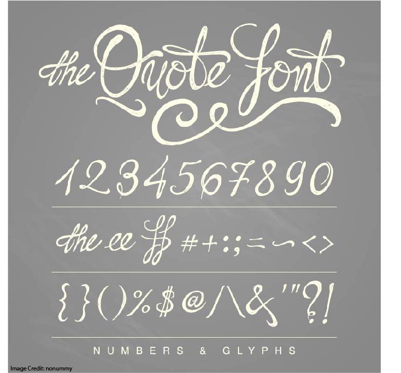
Back in 2011, Connor Diemand-Yauman published a study about unusual fonts. (You read that right. Font. As in: typeface.)
He had students learn some information in an easy-to-read font (Arial, 100% black). They learned other information in a harder-to-read font (for example, Bodoni MT, 60% black).
When retested, they remembered more information in the hard to read font.
Being a thorough researcher, Diemand-Yauman tried this hypothesis out in a high school. He had teachers use the Arial font in one of their sections, and the Bodoni MT in another.
Sure enough, the hard-to-read fonts (called “disfluent”) lead to greater learning.
We teachers might take this study as an instruction to DO THIS THING. Given Diemand-Yauman’s results, that is, we should start using unusual fonts.
Using Research Well: Finding the Right Difficulty
Instead of DOING THIS THING, however, I think Diemand-Yauman’s research should inspire us to THINK THIS WAY.
Specifically, we should think about finding the right level of difficulty.
When students take on relatively simple material, we can help them learn it better by adding a bit of challenge.
We might — for example — print that information in a disfluent font.
We might space out practice further than usual.
Or, we might interleave this topic with other, similar kinds of information.
But: when students learn complex material, we don’t want to make it any more difficult. In this case, the font should be as fluent as possible. We would space practice out, but not so far. We would interleave, but not so much.
In other words: Diemand-Yauman’s research doesn’t tell us to use quirky fonts (“do this thing”).
Instead, it gives us another option for creating desirable difficulty (“think this way”).
But Wait: Does That Font Thing Really Work?
A just-published meta-analysis says: not so much. In the authors’ words:
“there is not enough evidence to show that it [using disfluent fonts] either stimulates analytic processing or increases extraneous cognitive load.”
In other words: hard-to-read fonts aren’t a desirable difficulty. And, they don’t stress working memory too much.
Although I haven’t looked at the nitty-gritty of this study (it’s behind a paywall), I have an alternate interpretation.
Perhaps in some cases disfluent fonts are a desirable difficulty. And, in other cases they stress working memory. In this case, those two findings would offset each other in a meta-analysis. The result would be — as this study finds — no consistent effect.
Who Decides?
If I’m right, a disfluent font might improve learning. Or, it might hinder learning.
So: who decides when to use one?
The answer is clear: THE TEACHER DECIDES. Only you know if the material is already hard enough (in which case, use a fluent font). Only you know if it needs some extra cognitive challenge to make it stick (in which case, think about a disfluent font).
No researcher can answer that question, because no researcher knows your curriculum, your school, and your students.
Rather than ask researchers tell you what to do, let them guide you in thinking about teaching problems in more effective ways.
If you’re especially interested in desirable difficulties, here’s an article about a potentially desirable difficulty that turns out to be…not.


